Brand identity is more than a logo–it’s a moment.
A story waiting to be told at every touchpoint. Who are you? Why do you exist? Why do you matter to me? Every surface, every space—an opportunity to make me feel, to make me think. To create not just impressions, but a system of stories, unfolding endlessly. Draw me in. Keep me engaged. Make me never forget you.
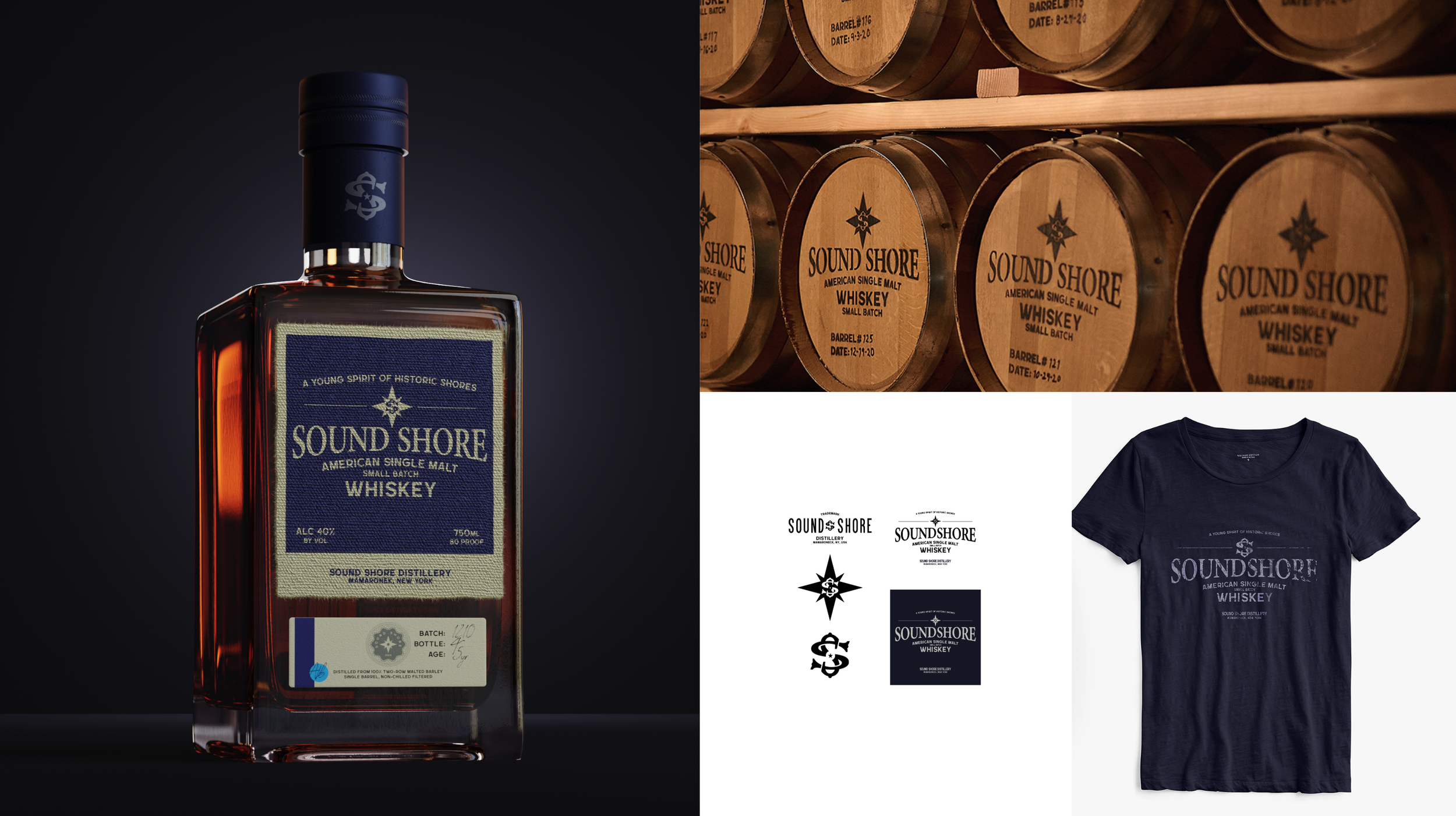
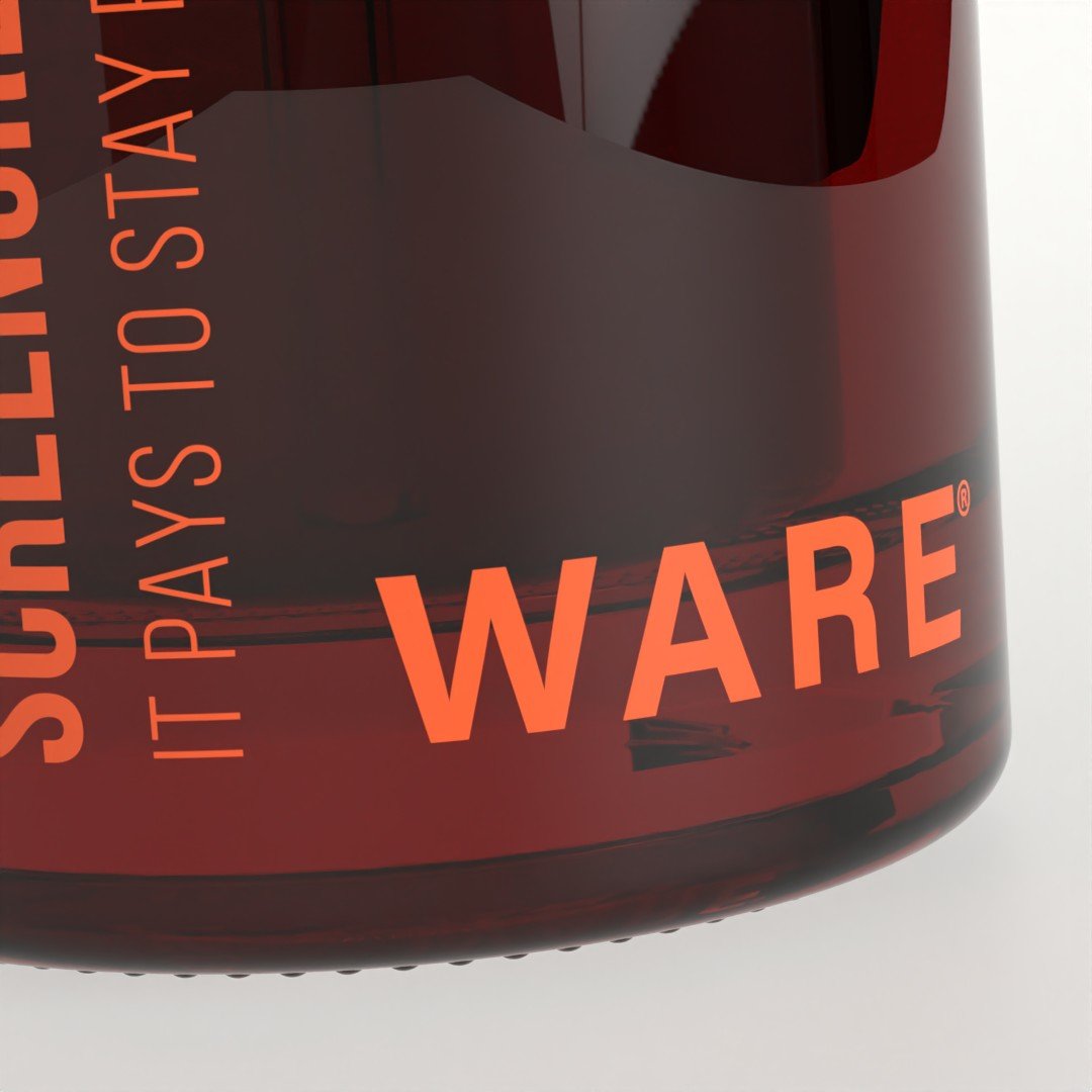
Sound Shore Distillery set out to become a premier American single-malt whiskey brand, requiring an identity that embodied its craftsmanship and passion. We created a design system that blended tradition with modern refinement—balancing rich, tactile materials with clean, contemporary typography. The packaging and digital presence conveyed authenticity and boldness, ensuring the brand stood out in a competitive market while staying true to its artisanal roots. The result was a timeless yet distinctive whiskey identity.

Citigold needed a brand identity that reflected its prestige and personalized service while seamlessly integrating into the lives of affluent customers. We created a design system rooted in rich simplicity, using texture, curated color, and clean and simple typography to evoke warmth, exclusivity, and trust. Gold was used sparingly for sophistication, while photography and materials reinforced a personal, intelligent, and understated experience, elevating Citigold’s position within the Citi brand ecosystem.


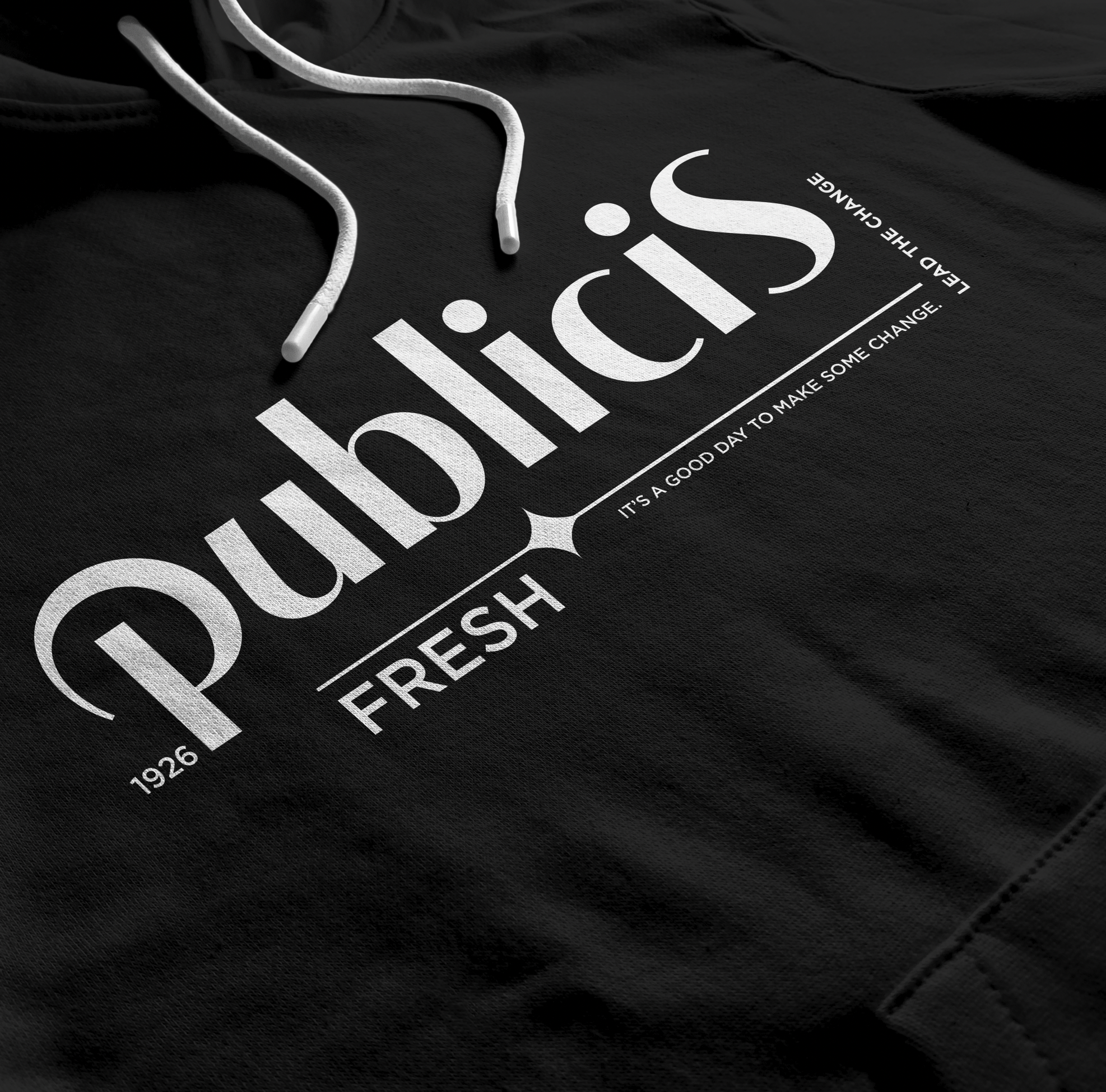
Publicis North America needed a modernized identity that honored its rich heritage. We developed a "History Forward" design system, drawing inspiration from its founding. At its core, a reimagined version of Marcel Bleustein-Blanchet’s original 1926 office door sign bridged past and future. This approach balanced tradition with innovation, positioning Publicis as a leader in the evolving advertising landscape.
Hooligan needed a brand identity that honored its legacy while capturing the energy and precision of its craft. We designed a dynamic wordmark inspired by film slices, breaking the logo into segments that reflect the editing process—fragmented yet seamless. This modular system extends into motion design, reinforcing the rhythm and spontaneity of post-production while maintaining a bold and ownable presence.

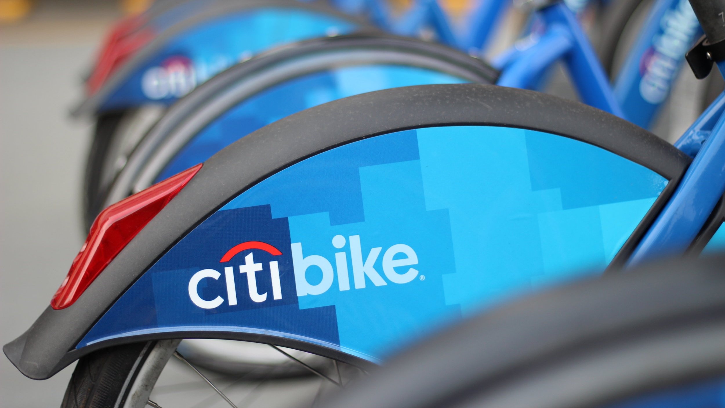
CREATING AN ICON. To launch Citi Bike, we developed Unlock New York, a campaign that built excitement while branding the entire program. A bold visual identity extended across outdoor ads, print, docking stations, and bikes, seamlessly integrating with a custom smartphone app for riders. Within six hours, Citi Bike gained 16,000 members, achieving massive visibility—including a cover feature on The New Yorker.
A new cosmetically-enhanced skincare line needed a brand identity that appealed to both traditional customers and a broader, diverse audience. We created an inclusive design system that transcended beauty industry norms, focusing on skincare benefits over cosmetic transformation. Messaging and visuals emphasized authenticity and accessibility, positioning the brand at the forefront of a more inclusive and evolving beauty landscape.

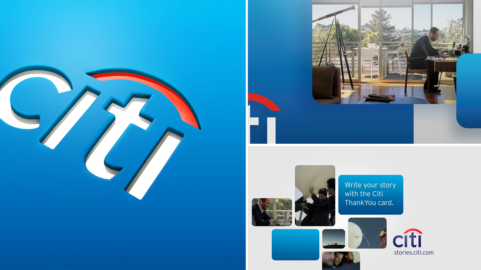
Citi, operating in 180 countries across diverse businesses—from Citi Bike and NY Mets sponsorships to retail banking and corporate finance—lacked a cohesive brand identity beyond its logo. We designed a flexible, modular system—like a box of Legos—allowing elements to adapt while maintaining continuity. A refined design language, with a standardized color palette, typography, and messaging, ensured consistency. The Blue Wave treatment added dynamism across media, while a streamlined communications architecture maintained a cohesive global narrative with local adaptability. This transformation elevated Citi’s brand equity, aligning its identity worldwide and reinforcing its position as a trusted financial leader, serving everyone from Citi Bike riders to multinational corporations.


