Citi Bike
Unlock New York.
CREATING AN ICON The campaign effectively used various channels—outdoor advertising, social media, and app integration—to promote the bike-sharing service.
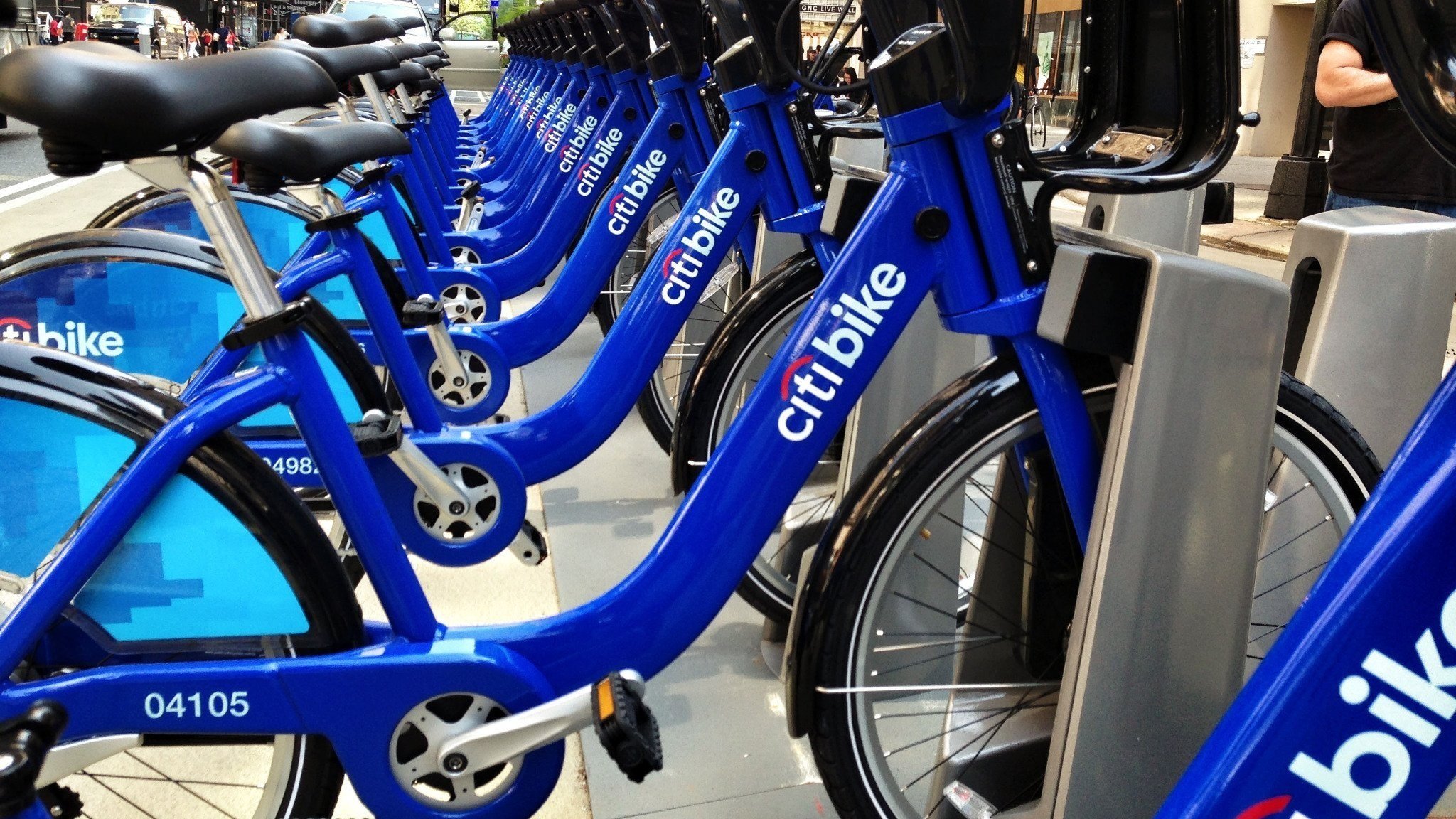
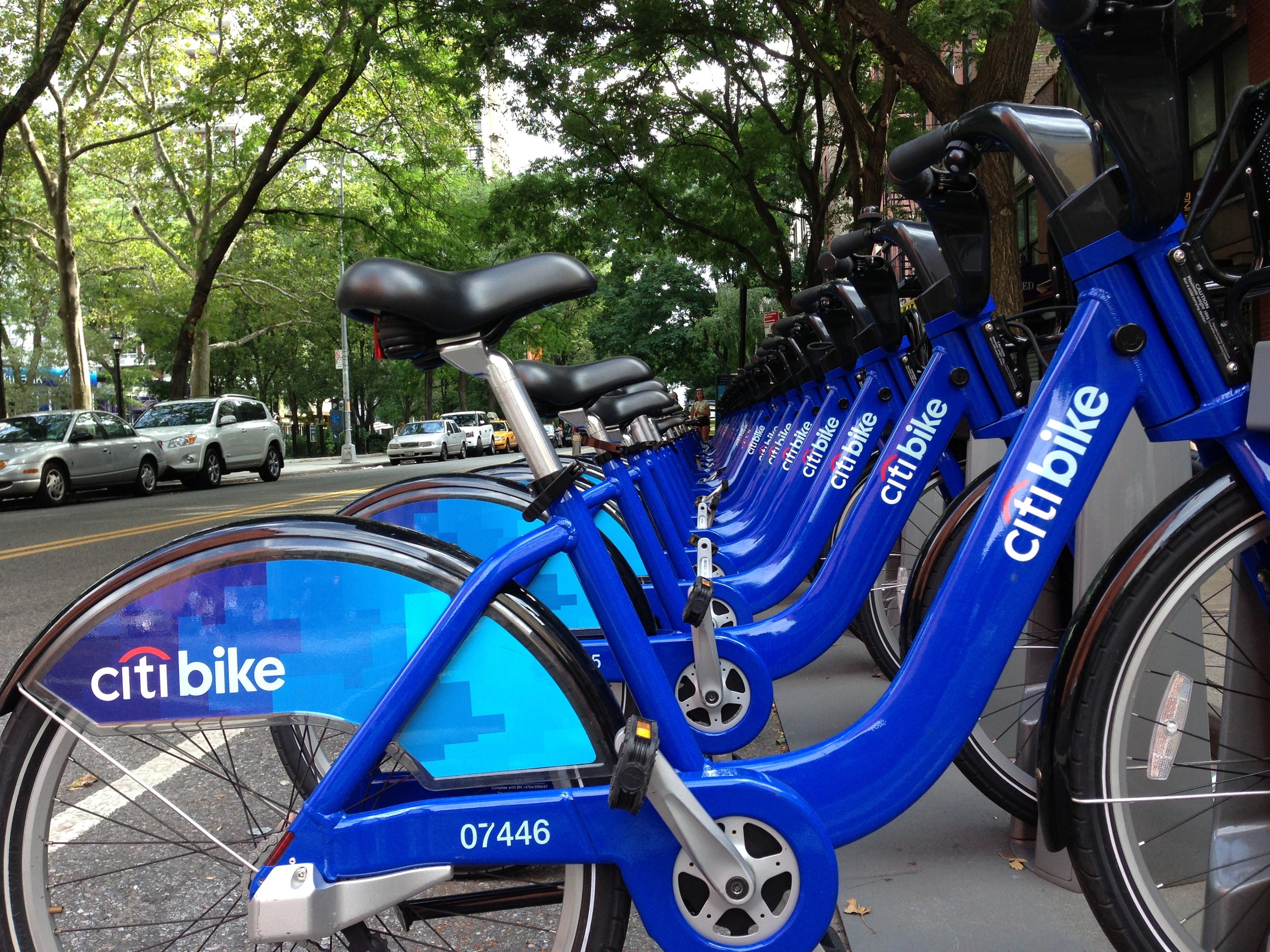
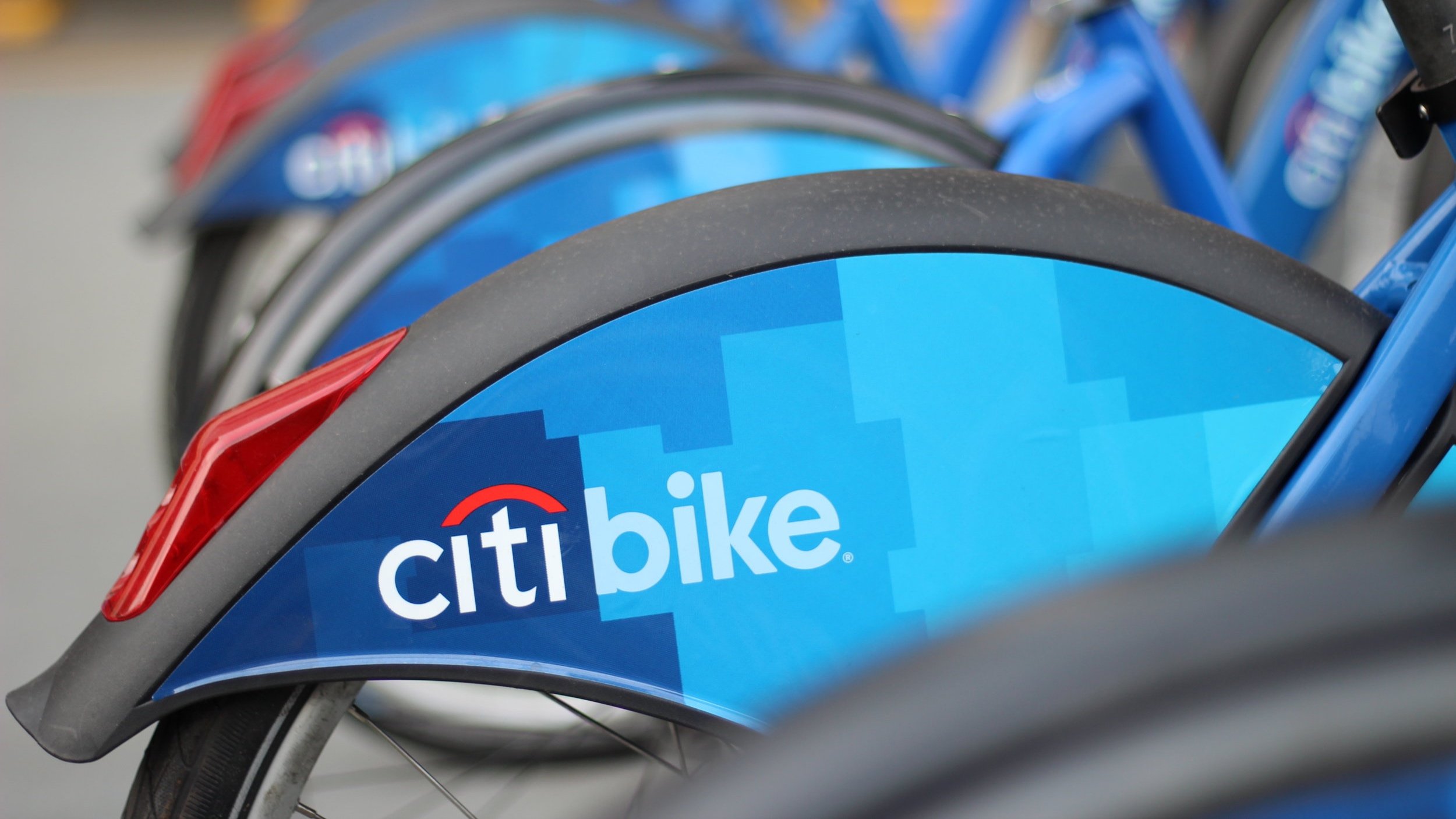
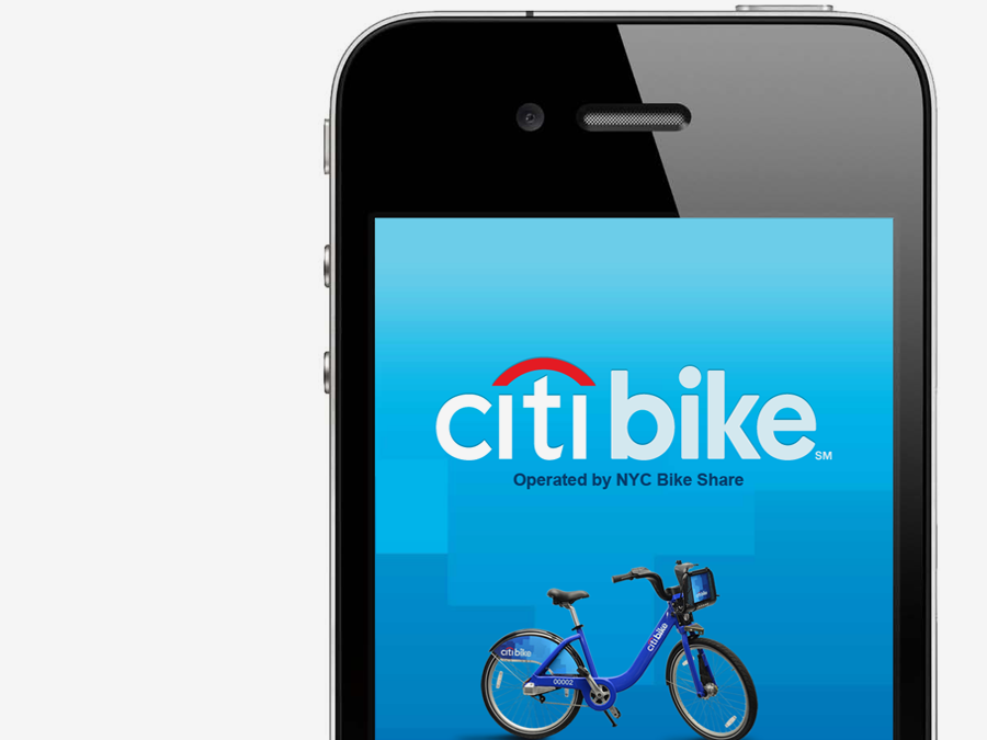
Our job was to generate excitement and brand the whole program. So we jumped right in with a campaign we called Unlock New York. It featured a unique look and feel that extended from posters and print ads to the docking stations and the bikes themselves. Then, we added to the program's functionality by creating a useful smartphone app for riders that helps you find bikes, plan routes and truly explore the city. In the first six hours of going live, Citi Bike signed up more than 16,000 members. And the program's visibility was incredible, garnering front-page headlines in the media and even making the cover of The New Yorker magazine.
BRAND ID • DIGITAL APP/SITE • CREATIVE DIRECTION-ART DIRECTION • DIGITAL STRATEGY


OPPORTUNITY: Citi needed to generate excitement and effectively brand New York City's new bike-sharing program as its sole sponsor.
SOLUTION: We launched the "Unlock New York" campaign with a unique visual identity across all touchpoints, including a smartphone app that enhanced rider experience, resulting in over 16,000 sign-ups within the first six hours and extensive media coverage.
USER RESEARCH: Research indicated a need for a strong, cohesive brand identity to differentiate the Citi Bike program from other transportation options in New York City. Insights from focus groups revealed that potential users valued both aesthetics and functionality in their bike-sharing experience.
PROCESS: The design process began with wireframing the app and developing the visual identity across all branding materials. Prototyping allowed for testing various app functionalities and visual elements. Iterations were made based on user feedback to ensure an intuitive user experience.
OUTCOME: The launch was a resounding success, with over 16,000 memberships within the first six hours. Media coverage was extensive, including a feature on the cover of The New Yorker, significantly raising program visibility.
ACCESSIBILITY: Design efforts included user testing to ensure the app was accessible to all users, incorporating features like larger text options and color contrast for improved visibility.
SYSTEMS: Citi Bike’s backend systems were built on a cloud-based architecture, enabling scalability and flexibility as the network expanded. The system utilized real-time data processing to monitor bike availability and station status, ensuring accurate information for users. Additionally, bikes were equipped with GPS technology for location tracking, and docking stations were connected through IoT devices to communicate seamlessly with the central system. This tech was fundamental material for the app we designed and built.


